This was a project I worked on over the course of three months during my Google UX certification. I was randomly assigned an app to design for an imaginary movie theater company.
In a classic movie theater environment, moviegoers must standing line and wait to speak to a ticket agent to purchase tickets, then wait in line again to purchase movie snacks. As agents can only help one person at a time, this process can take a long time or require a patron to visit the theater early to purchase tickets and then return again close to showtime, which is impractical if the patron lives any distance from the theater.
Times have changed.
The Solution
Moviegoers today are used to using technology to purchase tickets in advance and from the comfort of their own home or on-the-go. The goal of this project was to create a visually appealing process whereby a user could open an app and purchase tickets and snacks, freeing up time that they might overwise spend standing in line.
Understanding the User
Due to budget constrains and information accessibility, secondary research was conducted to determined the demographics of moviegoers and therefore who our users would be.
Research Findings
According to movieguide.org, 53%of moviegoers visit the theater between 2 and 11 times a year, making our largest demographic of visitors only attending the theater once a month at best and once every six months at worst.
Research also showed that the two largest age groups of moviegoers are 25-39 years old at 24%, followed by 60+ seniors at 17%. All other age groups fell between 10-13% respectively.
To learn how other companies in the same market are implementing similar technologies, I did a competitor analysis that included a local theater, a regional chain, and two national companies.
Personas
After doing competitor research, I considered several use cases of the types of people who go to the theater, including teenagers on dates, families, and older couples. I also took into account how users with disabilities may find a theater experience different than a typical user without disabilities and created several personals based on that information
To make sure the final app met the needs of all users, I referenced these personals frequently throughout the life cycle of the project.
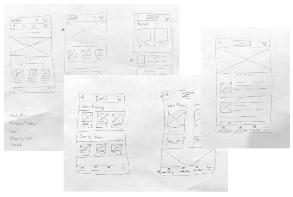
Sketches
I started the design process with several quick sketches of potential home page layouts, listing out other pages and functionalities I would like to include.
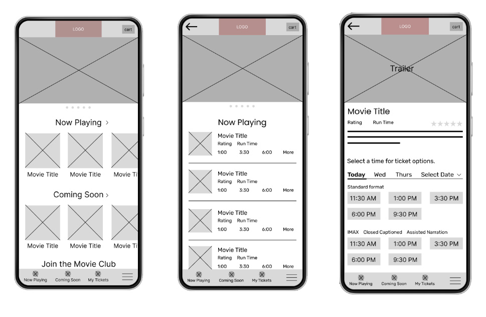
Wireframes
With an idea of what I wanted the layout to be based on my paper sketches, I created wireframes of the primary pages in Figma.
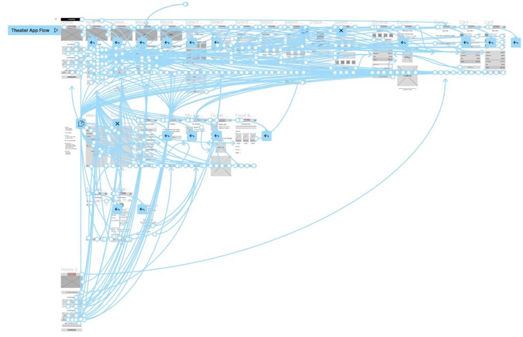
Low-Fidelity Prototypes
With the wireframes completed, it was time to incorporate real text to get a feel for how the site would really feel and be used, and then connect the low-res views into a functioning prototype.
User Testing
I ran a user test of 6 users, ages 12 to 65. Through this process I was able to identify a few areas that were confusing to some users and implement design modifications to improve the flow before crating a high-fidelity prototype.
After creating the high-fidelity prototype, I ran another user test on 5 users, again ages 12 to 65, to identify any other rough areas in the process. This test was much smoother with only minor design changes implemented afterward to come to a final design.
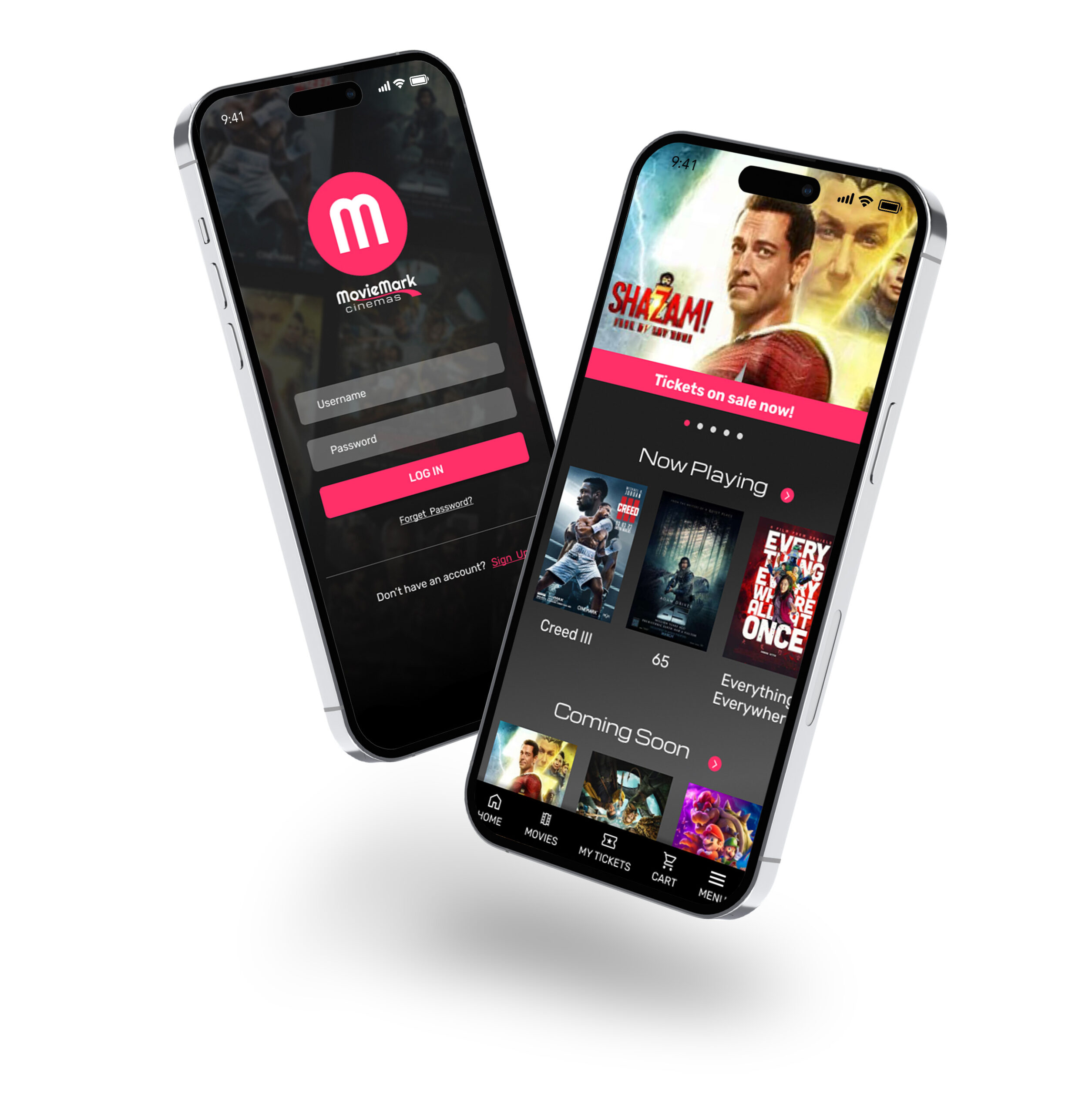
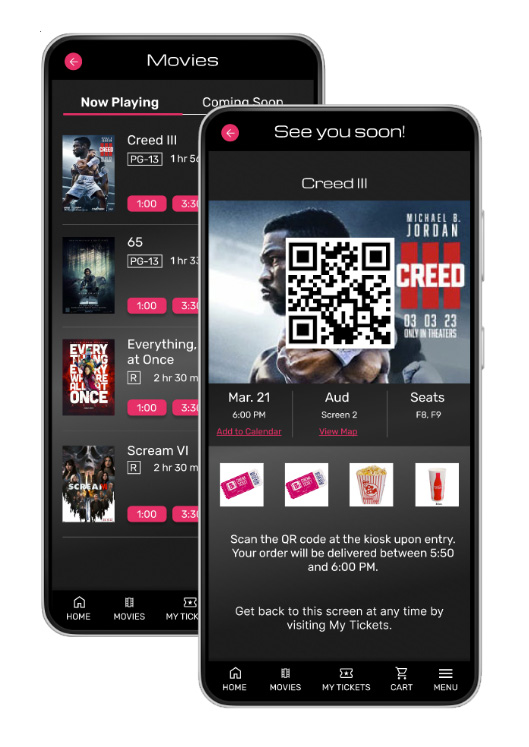
The Final Design
The purpose of this app was to allow the users to purchase tickets and snacks without being at a theater in-person. Additional functionalities include watching movie trailers, creating and managing a loyalty account, and setting preferences that the company can use in marketing campaigns.
I decided on a red/black color scheme to give the app a dramatic feel.
This was a fun project, but I was itching the whole time to get to the high-fidelity designs. As soon as I was assigned the project, I laid down some ideas of colors and whatnot that I may want too use in the final design, which I was able to do since this wasn’t a real company and I wasn’t provided a palette to work from.
I ended up not using any of it. By the time I went through the lo-fi testing and implemented the hi-fi prototype, I could se where my initial ideas had fallen short and was able to modify my original plan to come up with something that was a much better experience.
We as designers think we can put a design together that makes a good process, but it’s incredible the things we find when we do some user testing and see how other people think through the process.