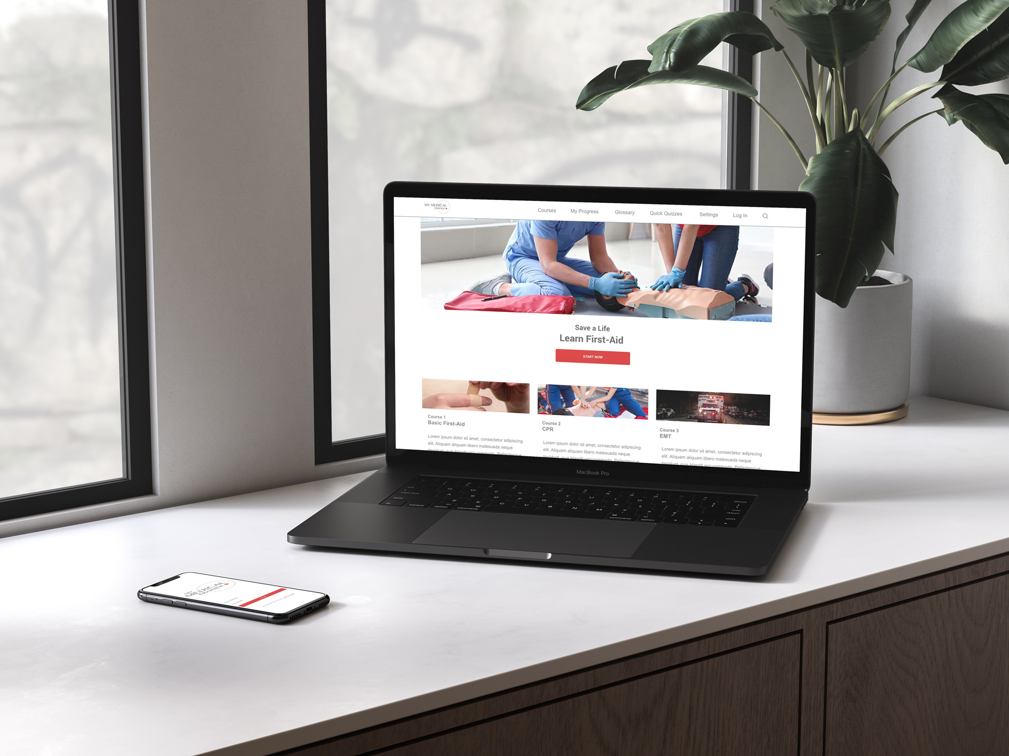
I recently completed a Google UX Certification, during which I was tasked with creating a website and app for a company wanting to provide free basic medical training via online videos, with the possibility of offering more advanced courses and certifications in the future.
You never know when or where medical expertise will be required.
The Solution
My Medical Trainer was conceived to provide free training via web-based videos. A user can create an account, select a training course, and watch instructional videos about a variety of subjects. Completion of basic courses unlock more advanced courses.
Quizzes, reviews, and a searchable glossary are provided as ways to maintain learned medical knowledge.
Understanding the User
This website is intended for people who are interested in basic medical training but have limited time.
Personas
Several personas were created for this project, including:
Julia – a 27 year old mother of two young children who wants to know what to do if her children are involved in an accident.
Caleb – a 17 year old high school student who is interested in becoming a paramedic after graduating.
Molly – a 24 year old teacher who wants to learn medical care in case of an emergency at her school.
Competitor Research
To learn how other companies in the same market are presenting their offerings, a competitor analysis was conducted and analyzed.
Competitors included:
American Red Cross – the most well-known of the competitors, the American Red Cross focuses primarily on blood donation, but also offers basic medical training courses such as CPR.
National Safety Council – is a nonprofit safety advocate focused on eliminating preventable injuries and deaths and also offers first-aid training at the workplace.
National Health Care Provider Solutions (NHCPS) – provides healthcare training and certification courses
Low-Fidelity Prototypes
Using the already-designed app as an outline, I started by creating low-fidelity designs for a mobile version of the website, then scaled up to tablet, laptop, and large desktop views, after which I developed these fews into low-fidelity prototypes.
User Testing
I conducted user testing before finalizing the designs and moving into High Fidelity design. This particular design didn’t have any major design problems, having already smoothed out the process in the app design.
The Final Design
The purpose of this website was to allow users of all ages to quickly find information on and begin learning through a basic, free medical course. With this in mind, I wanted to have a clean, simple layout that most users would feel comfortable with.
The final high-fidelity prototype can be accessed below.