As Lead UX Designer, I’ve been working on the 4life website for about 7 years now. It continues to be a work in progress to keep up with changing design styles and latest trends.
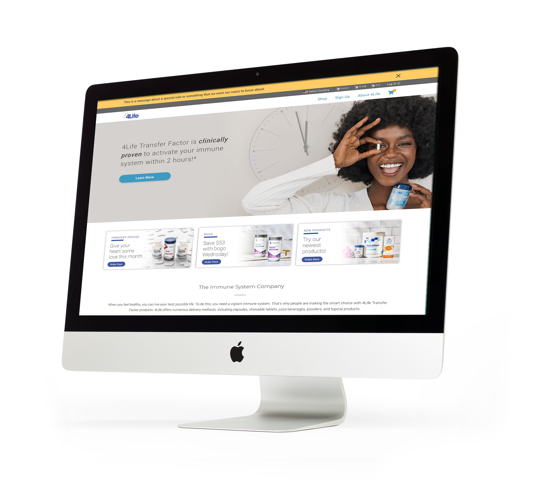
Ok, so not way back, or even when the company was founded, but when I started at 4Life in 2016, this is the design I was first tasked to update.
The design, as you can see, was basic squares. Nothing was below the fold, and the site wasn’t very responsive. So I took this design and completely threw it out the window and started over. There was a lot of content being offered on the website, but I felt that the information architecture in the then-current design wasn’t providing a means to access this content.
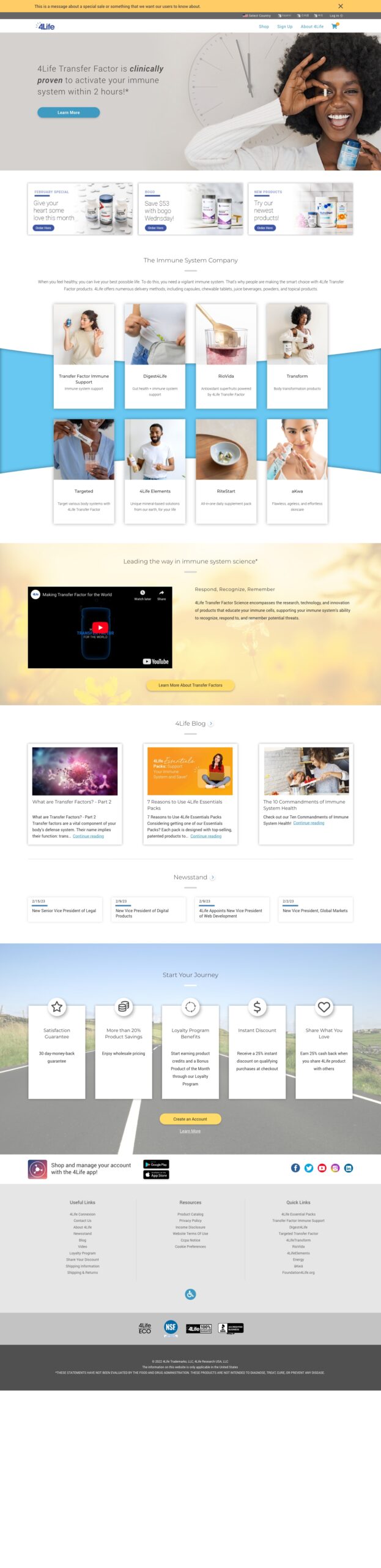
I broke the home page into sections, first with a large, eye-catching banner (which updates about once a month these days), followed by ad space, then a section dedicated to 4Life’s products. A recent addition was the video section presenting 4Life’s unique offering in the marketplace, followed by blog and news sections. The last section presents an offering to join 4Life as an affiliate. While many other companies would prefer this section higher in the page, due to 4Life’s MLM structure, most new affiliates are being helped through enrollment by someone who is already a member, so this section is actually a pretty low priority for the company.
I broke the home page into sections, first with a large, eye-catching banner (which updates about once a month these days), followed by ad space, then a section dedicated to 4Life’s products. A recent addition was the video section presenting 4Life’s unique offering in the marketplace, followed by blog and news sections. The last section presents an offering to join 4Life as an affiliate. While many other companies would prefer this section higher in the page, due to 4Life’s MLM structure, most new affiliates are being helped through enrollment by someone who is already a member, so this section is actually a pretty low priority for the company.
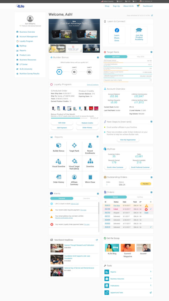
The Affiliate Dashboard
When someone creates an affiliate account on 4Life.com and logs in, they land on the Dashboard. This is an important page because it presents the user information concerning their account and business standing, and also helps to help the user navigate to areas of the website that are important for his or her business.
Working with the Marketing department, we created an ad space at the top-left corner of their Dashboard, making sure they’re able to see the latest news and offerings from the company.
Other sections present the user with snapshots of where they stand in their rankings, their qualifications for certain bonuses, upcoming order information, personal and organization alerts, and order history.
Reports
Among the most important areas of the website for an affiliate are the reports. 4Life provides many reports to help the affiliates understand where they land in the business’s pay structure, find what they are lacking to advance, and who they can support in their organization to qualify for higher ranks and bonuses.
I’ve probably spent more time on these reports pages than anywhere else on the website, including the home page. There is a massive amount of data that can be displayed, so I am continually tying to improve the information architecture to ensure the data being shown to make sure it is useful to the end user.
Many of the affiliates are from third-world countries, so they also need the information presented in a way that they can understand, not having had the advantage of higher education. For this reason, the design team is constantly reviewing the graphical elements of the design to ensure we’re presenting the information as simply as possible for those who want simple, while still providing a way to drill deeper into the date for others who like digging deep.