Aside from my full-time job as a UX designer, I’m also the water operator for my small town. I work with Blue Stakes of Utah on occasion when requesting utilities mark their locations so I can dig, or when tickets come to me from Blue Stakes to mark our water lines.
I recently downloaded the Blue Stakes app and my designer’s eye started twitching. So, for a personal project, I took it upon myself to redesign their app to be both easier to look at and more useful.
Responsibilities: High-fidelity design
The Problem
In the state of Utah there are thousands of miles of buried water and gas pipelines, electrical lines, fiber optic cables, telephone lines, etc. Whenever someone digs, they could potentially hit one of these and cause harm to themselves as well as nearby properties and utilities.
Blue Stakes of Utah works with utility companies by accepting requests to mark utility lines and sending those requests on to the appropriate companies, thereby minimizing the risk of damage to a buried cable or pipeline.
The Solution
Residents preparing to dig may not always be at a location with a computer and would be better served by having a Blue Stakes app where they can fill out a form to create a request. Utility providers are almost always away from a computer and could utilize an app when marking, responding to, or updating marking requests.
Understanding the User
According to Blue Stakes’ website, there are four types of users:
DIYers and Professional Excavators generally utilize the same functionalities, getting information and submitting locate requests.
Facility Owners, who own and/or operate utilities, need additional functionalities to respond to and update locate requests.
Engineers don’t put in requests but use information available on the website.
Sketches
Fortunately for me, this project was personal and I am a user, as both an individual and as a utility representative. That gave me significant insight into what improvements could be made to the app to service DIYers/Excavators and Facility Owners.
I started the design process with several quick sketches of potential home page layouts, listing out other pages and functionalities I would like to include.
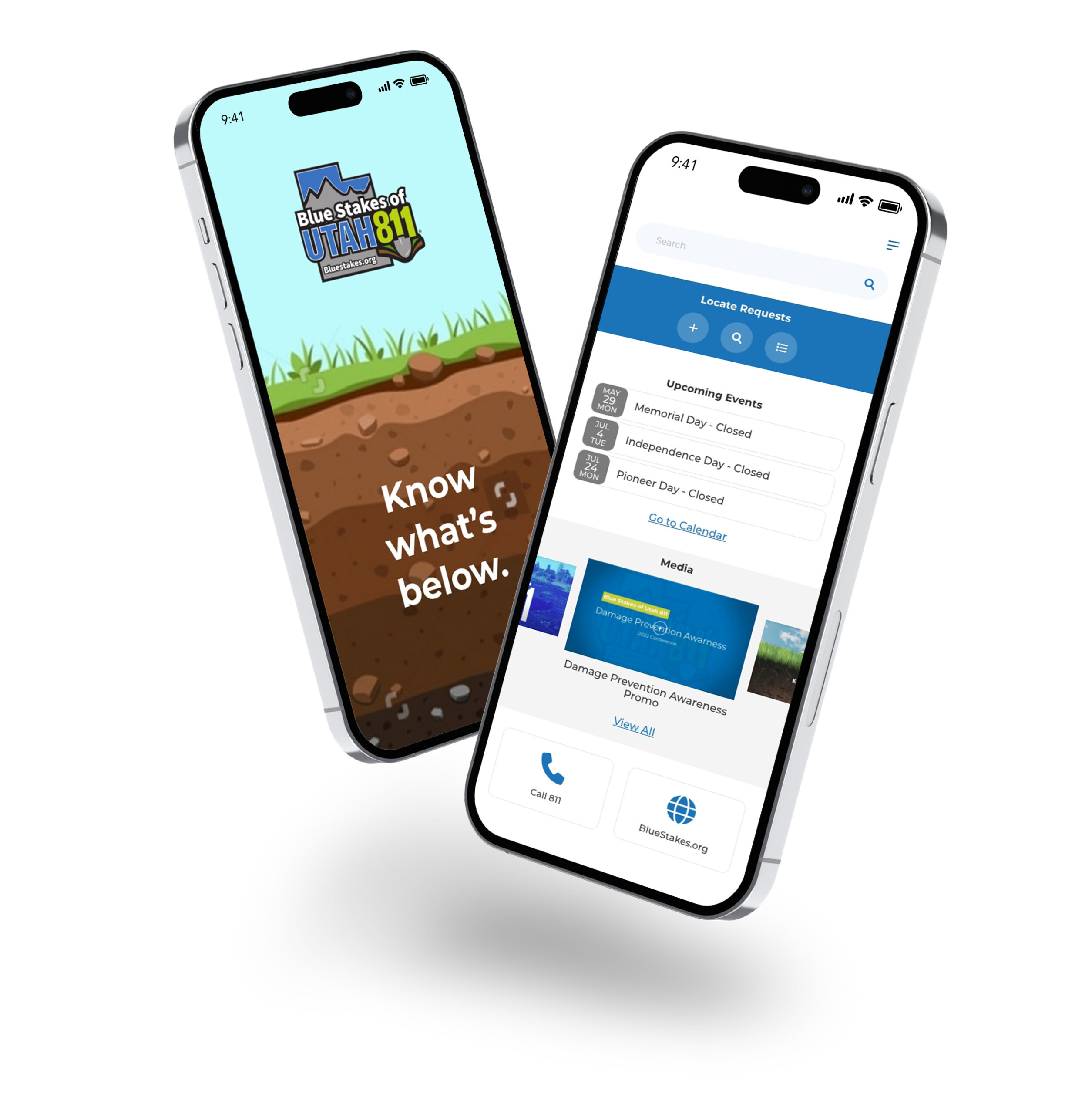
The Final Design
I already had a picture in my mind of how I wanted this app to look, so I’ll admit I jumped straight from sketches into high-fidelity design.
Using the company’s established color scheme, I was able to quickly put together a clean, attractive new layout that is inviting to the user. Information is displayed in a hierarchy based on user traffic, with the most requested information – locate requests – listed first, followed by the calendar, then training and informational media.